ShopDreamUp AI ArtDreamUp
Deviation Actions
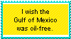
COUNTRY FLAG STAMP COLLECTION
Show your support/allegiance to a country by proudly flying the flag on DeviantART.
$1/month


Suggested Deviants


Suggested Collections


You Might Like…


Featured in Groups


Description
I live in the Metro-New Orleans area. My parents are from New Orleans, as were their parents. (German ( including Germanian Jew, which is still German ),Irish, French ( Cajun, of course ), Dutch, and probably more. )
The Gulf is a longtime neighbor of mine, in other words.
Many of my relatives were/are shrimpers and crabbers. This is a serious issue for all of us. Oil won't last for humanity to use forever, but the bounty of the self-sustaining sea could and should be available forever. Damn BP and HB and all other companies involved. Damn the politicians ( so many! )who opened the door for oil drilling in the Gulf AGAIN.
Dead Zones. THere are Dead Zones in the Gulf of Mexico now. There are, and will be, cover-ups about the damage done and ongoing. It's a disgrace. An outrage. People like me feel helpless and pessimistic.
Anyway...
Use if you want to, but please only on dA and never claim as yours. No reuploading. PLEASE FAVE IT, TOO. Is it that much to ask?
This stamp maker helped me to create this stamp-- [link]
I made it, so it's my property, like all of the other stamps I've posted on dA.
Angry because you cannot comment here? Go fly a kite (Smile)")
The Gulf is a longtime neighbor of mine, in other words.
Many of my relatives were/are shrimpers and crabbers. This is a serious issue for all of us. Oil won't last for humanity to use forever, but the bounty of the self-sustaining sea could and should be available forever. Damn BP and HB and all other companies involved. Damn the politicians ( so many! )who opened the door for oil drilling in the Gulf AGAIN.
Dead Zones. THere are Dead Zones in the Gulf of Mexico now. There are, and will be, cover-ups about the damage done and ongoing. It's a disgrace. An outrage. People like me feel helpless and pessimistic.
Anyway...
Use if you want to, but please only on dA and never claim as yours. No reuploading. PLEASE FAVE IT, TOO. Is it that much to ask?
This stamp maker helped me to create this stamp-- [link]
I made it, so it's my property, like all of the other stamps I've posted on dA.
Angry because you cannot comment here? Go fly a kite
Image size
100x56px 769 B
© 2011 - 2024 HopeSwings777
Comments1
The color scheme is pretty good here. Using the stamp maker can limit you on things you can do. Personaly I would use a different color scheme, maybe reversing it to make the background seem more like the ocean and the border like the sun but this is okay. I support the message and the grammar used is pretty good. An exclaimation mark would put more emphasis on the message and draw more attention to it, but this is simple and follows the KISS (Keep it it simple stupid) rule of design. This is okay and for one with limited resourses is a nice idea.
Comments have been disabled for this deviation